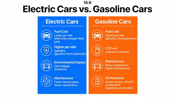
Electric vs Gasoline Cars Comparison Infographic
提示詞
A visual comparison chart (a “vs.” infographic) comparing electric cars and gasoline cars. The chart should have two columns, with icons and brief text comparing them on factors like Fuel Cost, Environmental Impact, Maintenance, and Performance. The design should be clean, modern, and easy to understand at a glance, demonstrating the ability to visually organize and present comparative data. –ar 16:9
已有 46 人用過這個提示詞
- 尺寸
- 600 × 337
 Seedream 4.5
Electric vs Gasoline Cars Comparison Infographic
A clean and modern infographic comparing electric vehicles and traditional gasoline cars. The visual chart features two distinct columns with icons and concise text, highlighting key differences in fuel costs, environmental impact, maintenance requirements, and overall performance. This educational design is optimized for quick readability, providing a clear overview of the benefits and trade-offs between EV technology and internal combustion engines for eco-conscious consumers and automotive enthusiasts.
相似作品
返回圖片社群

Hand-Drawn Thai Recipe Infographic on Grid Paper
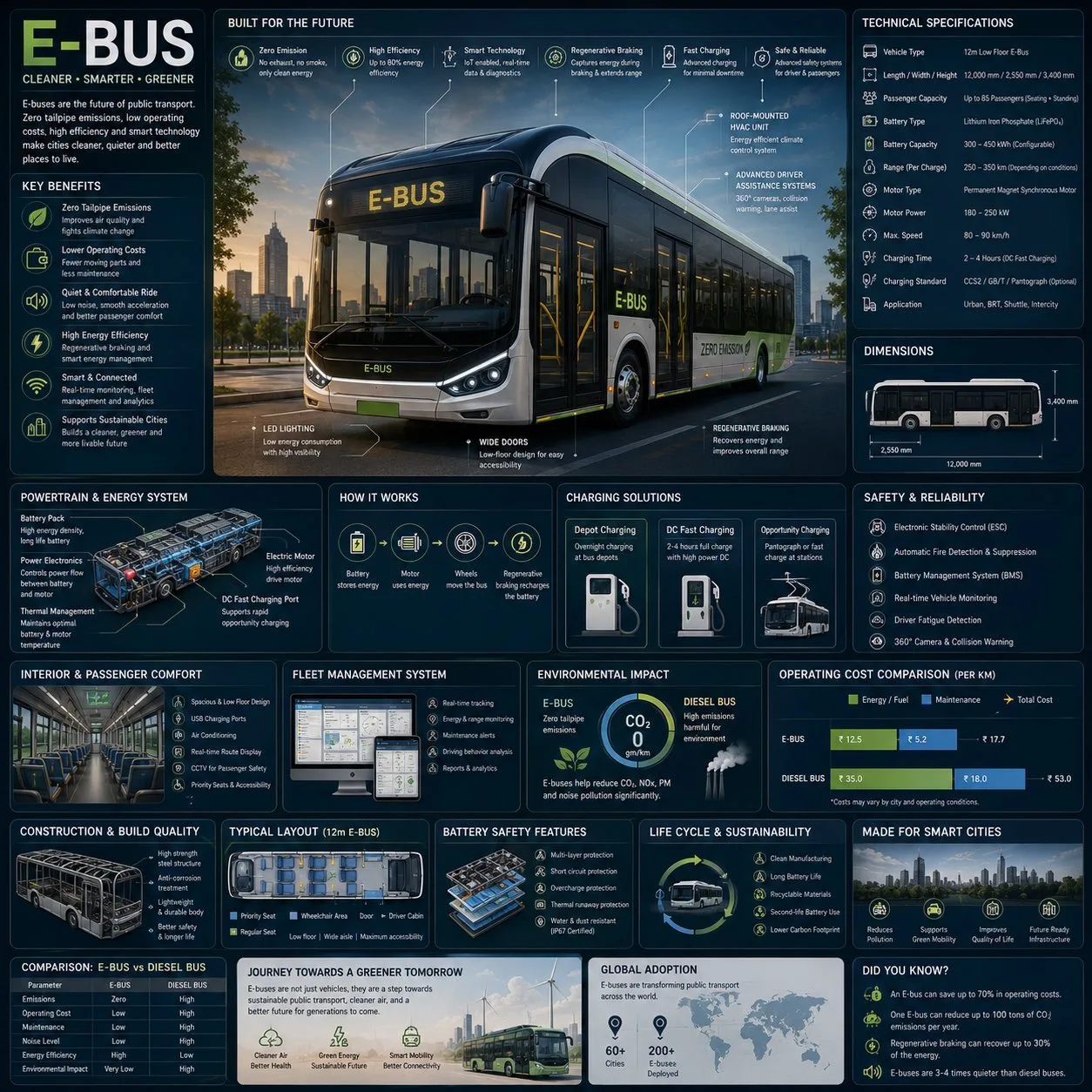
Futuristic Electric City Bus Engineering Infographic
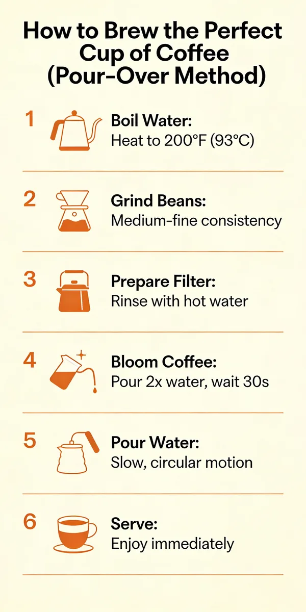
Step-by-Step Pour Over Coffee Brewing Guide
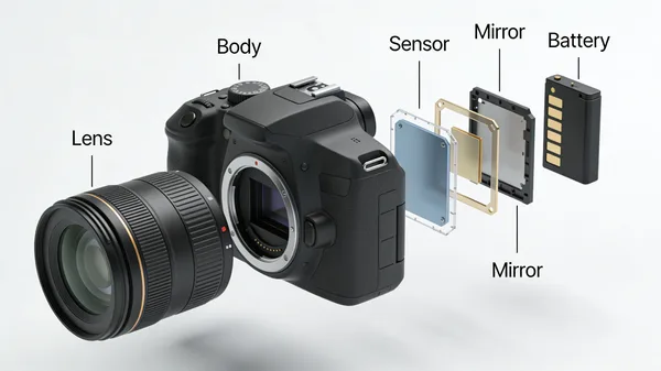
Exploded View Technical Illustration of DSLR Camera
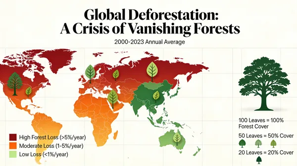
Global Deforestation Data Visualization Map

Detailed 3D Scientific Illustration of a Plant Cell

Passive Solar Design Architectural Blueprint

Isometric Illustrated National Park Map
做出了滿意的作品?
把你的作品分享到圖片社群。分享的圖片會永久保存,發布後還能獲得點數獎勵。