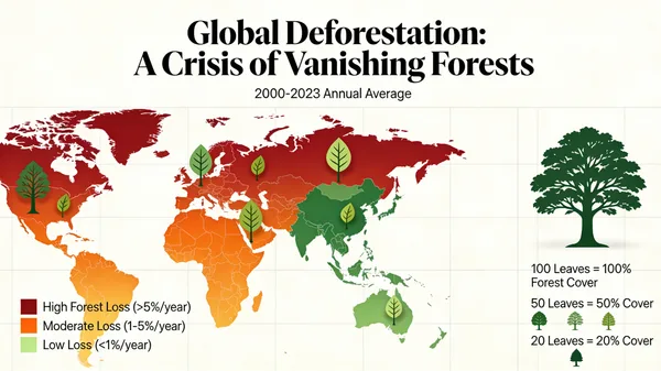
Global Deforestation Data Visualization Map
프롬프트
A beautiful and informative data visualization for a report on global deforestation. The main visual could be a world map where countries are colored based on their rate of forest loss, or a series of stylized tree graphics where the number of leaves represents the remaining forest cover. The design should be impactful and emotionally resonant, not just a dry chart, demonstrating the ability to turn data into a compelling visual story. –ar 16:9
61명이 이 프롬프트를 사용했습니다
- 크기
- 600 × 337
 Seedream 4.5
프롬프트 및 이미지 제작: Jared Liu
수집 출처: Awesome Seedream 4.5 Prompts (CC BY 4.0)
이미지의 모든 권리는 원작자에게 있습니다. 삭제를 원하시면 문의해 주세요.
Global Deforestation Data Visualization Map
A compelling and impactful data visualization representing global deforestation rates. The design features an artistic world map with color-coded regions illustrating forest loss, combined with stylized tree graphics that symbolize dwindling canopy cover. This informative graphic blends scientific data with an emotionally resonant aesthetic, serving as a powerful visual narrative to raise awareness about environmental conservation and the urgent need to protect our planet's vital ecosystems.
비슷한 작품
갤러리로 돌아가기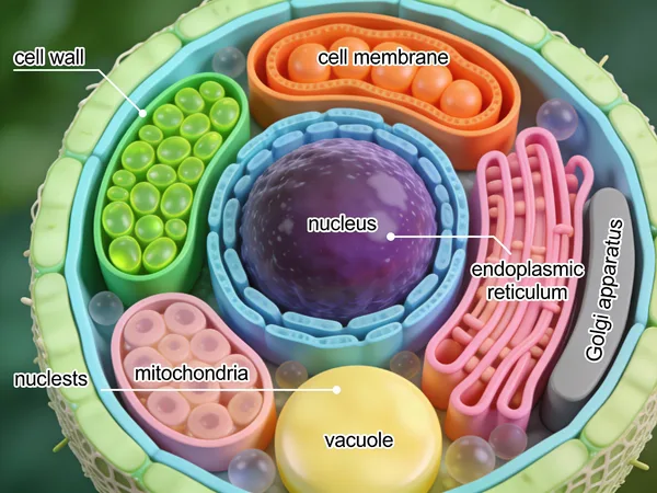
Detailed 3D Scientific Illustration of a Plant Cell
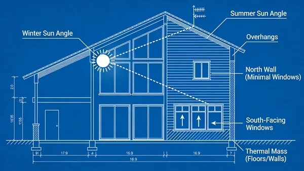
Passive Solar Design Architectural Blueprint

Isometric Illustrated National Park Map

How FDM 3D Printing Works Diagram

Ergonomic Desk Posture Safety Infographic

Rustic Homemade Pasta Recipe Card Illustration
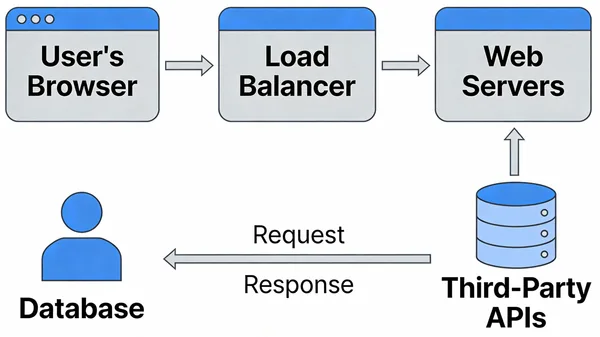
Modern Web Application System Architecture Diagram

High Energy Try Not To Laugh Challenge Thumbnail
마음에 드는 작품을 만드셨나요?
작품을 갤러리에 공유하세요. 공유한 이미지는 영구 보관되며, 게시되면 크레딧을 받을 수 있습니다.