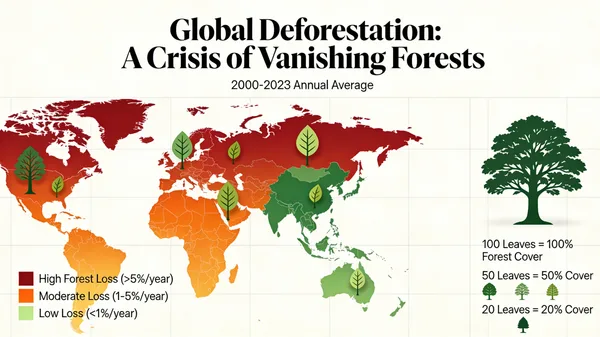
Global Deforestation Data Visualization Map
プロンプト
A beautiful and informative data visualization for a report on global deforestation. The main visual could be a world map where countries are colored based on their rate of forest loss, or a series of stylized tree graphics where the number of leaves represents the remaining forest cover. The design should be impactful and emotionally resonant, not just a dry chart, demonstrating the ability to turn data into a compelling visual story. –ar 16:9
61 人がこのプロンプトを使いました
- モデル
- Seedream 4.5
- サイズ
- 600 × 337
 Seedream 4.5
プロンプト・画像の作者: Jared Liu
収録元: Awesome Seedream 4.5 Prompts (CC BY 4.0)
画像の権利は原作者に帰属します。削除をご希望の場合はお問い合わせください。
Global Deforestation Data Visualization Map
A compelling and impactful data visualization representing global deforestation rates. The design features an artistic world map with color-coded regions illustrating forest loss, combined with stylized tree graphics that symbolize dwindling canopy cover. This informative graphic blends scientific data with an emotionally resonant aesthetic, serving as a powerful visual narrative to raise awareness about environmental conservation and the urgent need to protect our planet's vital ecosystems.
似ている作品
ギャラリーに戻る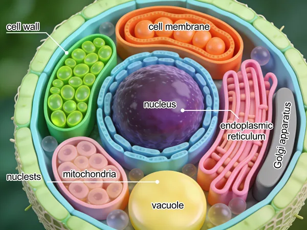
Detailed 3D Scientific Illustration of a Plant Cell
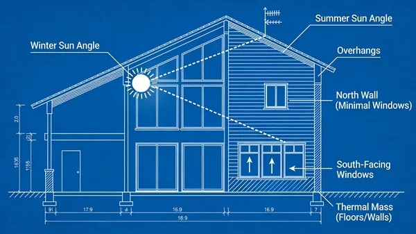
Passive Solar Design Architectural Blueprint

Isometric Illustrated National Park Map

How FDM 3D Printing Works Diagram

Ergonomic Desk Posture Safety Infographic

Rustic Homemade Pasta Recipe Card Illustration
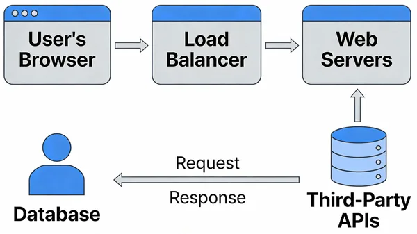
Modern Web Application System Architecture Diagram

High Energy Try Not To Laugh Challenge Thumbnail
満足のいく作品ができましたか?
作品をギャラリーにシェアしましょう。シェアした画像は永久に保存され、公開されるとクレジットがもらえます。